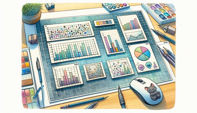
Using Subplots in Matplotlib
When you're working on data visualization in Python, chances are you've turned to Matplotlib, the workhorse library for creating plots and graphs. While single plots are great, sometimes you need to compare different datasets side-by-side or arrange multiple visualizations in a grid. That's where subplots come in. They let you create a figure with multiple, distinct plots arranged in rows and columns. In this article, we'll explore how to effectively use subplots in Matplotlib to make your data storytelling clearer and more impactful.
Creating a Basic Subplot Grid
The most common way to create subplots is by using plt.subplots(). This function returns a figure object and an array of axes objects, which you can then use to plot your data. Let's start with a simple example: creating a 2x2 grid of subplots.
import matplotlib.pyplot as plt
import numpy as np

# Create some sample data
x = np.linspace(0, 10, 100)
y1 = np.sin(x)
y2 = np.cos(x)
y3 = np.tan(x)
y4 = np.exp(x)

# Create a 2x2 grid of subplots
fig, axes = plt.subplots(nrows=2, ncols=2, figsize=(10, 8))

# Plot on each subplot
axes[0, 0].plot(x, y1)
axes[0, 0].set_title('Sine Wave')

axes[0, 1].plot(x, y2)
axes[0, 1].set_title('Cosine Wave')

axes[1, 0].plot(x, y3)
axes[1, 0].set_title('Tangent Wave')

axes[1, 1].plot(x, y4)
axes[1, 1].set_title('Exponential Growth')

# Add a common x and y label
fig.text(0.5, 0.04, 'X Axis', ha='center')
fig.text(0.04, 0.5, 'Y Axis', va='center', rotation='vertical')

plt.tight_layout()
plt.show()
In this code, nrows and ncols define the grid size, and figsize sets the dimensions of the entire figure. The axes object is a 2D array, and you can access each subplot using indexing, just like a NumPy array.
| Subplot Position | Function Plotted | Data Range |
|---|---|---|
| (0,0) | Sine | 0 to 10 |
| (0,1) | Cosine | 0 to 10 |
| (1,0) | Tangent | 0 to 10 |
| (1,1) | Exponential | 0 to 10 |
- Start by importing Matplotlib and NumPy
- Use
plt.subplots()to create the grid - Access each axis using row and column indices
- Customize each plot individually
- Use
tight_layout()to avoid overlapping elements
Notice how we used fig.text() to add common axis labels. This is a handy trick when you want to label the entire figure rather than each individual subplot. Also, plt.tight_layout() automatically adjusts the spacing between subplots to prevent labels from overlapping.
Adjusting Subplot Layout and Spacing
Sometimes the default spacing between subplots isn't quite right. Matplotlib provides several ways to adjust the layout. You can use the subplots_adjust() function to manually set the spacing, or you can continue to rely on tight_layout(), which often does a good job automatically. However, for more control, let's look at an example using subplots_adjust().
fig, axes = plt.subplots(2, 2, figsize=(10, 8))

# Plot some data (using the same x, y1, y2, y3, y4 as before)
axes[0,0].plot(x, y1)
axes[0,1].plot(x, y2)
axes[1,0].plot(x, y3)
axes[1,1].plot(x, y4)

# Adjust the spacing
plt.subplots_adjust(left=0.1, bottom=0.1, right=0.9, top=0.9, wspace=0.4, hspace=0.4)

plt.show()
Here, wspace controls the width spacing (horizontal space between subplots), and hspace controls the height spacing (vertical space). The left, bottom, right, and top parameters adjust the margins of the entire figure.
| Parameter | Description | Typical Value Range |
|---|---|---|
| left | Left margin of the subplots | 0.0 to 1.0 |
| bottom | Bottom margin of the subplots | 0.0 to 1.0 |
| right | Right margin of the subplots | 0.0 to 1.0 |
| top | Top margin of the subplots | 0.0 to 1.0 |
| wspace | Width space between subplots | 0.0 to 1.0 |
| hspace | Height space between subplots | 0.0 to 1.0 |
- Use
subplots_adjust()for fine-grained control over spacing wspaceandhspaceare particularly useful for preventing clutter- Experiment with values between 0.0 and 1.0 to find the best fit
Remember that these values are relative to the figure size, so you might need to tweak them based on your specific figure dimensions. If you're unsure, start with tight_layout() and only use manual adjustment if necessary.
Advanced Subplot Configurations
Not all subplot grids need to be uniform. Sometimes you want one subplot to span multiple rows or columns. Matplotlib provides subplot2grid() for this purpose, offering more flexibility in layout.
# Create a figure
plt.figure(figsize=(10, 8))

# Create a subplot that spans 2 rows and 2 columns
ax1 = plt.subplot2grid((3, 3), (0, 0), colspan=2, rowspan=2)
ax2 = plt.subplot2grid((3, 3), (0, 2), rowspan=3)
ax3 = plt.subplot2grid((3, 3), (2, 0))
ax4 = plt.subplot2grid((3, 3), (2, 1))

# Plot on each subplot
ax1.plot(x, y1)
ax1.set_title('Large Subplot')

ax2.plot(x, y2)
ax2.set_title('Tall Subplot')

ax3.plot(x, y3)
ax3.set_title('Small Subplot 1')

ax4.plot(x, y4)
ax4.set_title('Small Subplot 2')

plt.tight_layout()
plt.show()
In this example, we define a 3x3 grid. The first subplot starts at (0,0) and spans 2 columns and 2 rows. The second starts at (0,2) and spans all 3 rows. The others are regular 1x1 subplots.
| Subplot | Grid Position | Column Span | Row Span |
|---|---|---|---|
| ax1 | (0,0) | 2 | 2 |
| ax2 | (0,2) | 1 | 3 |
| ax3 | (2,0) | 1 | 1 |
| ax4 | (2,1) | 1 | 1 |
- Use
subplot2grid()for non-uniform subplot layouts - Specify the grid shape, starting position, and span
- Ideal for dashboards or when emphasizing certain visualizations
This method is extremely powerful when you need to highlight a particular plot or create a dashboard-like layout. It does require a bit more planning, but the flexibility is worth it.
Sharing Axes Between Subplots
When comparing similar datasets, it's often useful to share axes between subplots. This ensures that the scales are identical, making direct comparison easier. Matplotlib makes this simple with the sharex and sharey parameters in plt.subplots().
# Create subplots with shared x and y axes
fig, axes = plt.subplots(2, 2, figsize=(10, 8), sharex=True, sharey=True)

# Plot data
axes[0,0].plot(x, y1)
axes[0,0].set_title('Sine')

axes[0,1].plot(x, y2)
axes[0,1].set_title('Cosine')

axes[1,0].plot(x, y3)
axes[1,0].set_title('Tangent')

axes[1,1].plot(x, y4)
axes[1,1].set_title('Exponential')

# Since axes are shared, we only need to set labels on the bottom and left subplots
for ax in axes.flat:
    ax.label_outer()  # Hide inner labels to avoid repetition

plt.tight_layout()
plt.show()
By setting sharex=True and sharey=True, all subplots share the same x and y axis scales. The label_outer() method is a convenient way to only show axis labels on the outer subplots, reducing clutter.
| Parameter | Effect |
|---|---|
| sharex | Share x-axis across all subplots |
| sharey | Share y-axis across all subplots |
| sharex='col' | Share x-axis within each column |
| sharey='row' | Share y-axis within each row |
- Use
sharexandshareyto synchronize axes - Reduce redundancy with
label_outer() - Perfect for comparative analysis
This approach not only saves space but also makes your visualizations more professional by ensuring consistent scaling. It's particularly useful when presenting multiple related graphs.
Adding Legends and Annotations
Once you have your subplots arranged, you might want to add legends, annotations, or other elements to enhance readability. Since each subplot is an independent axis, you can add these elements individually or for the entire figure.
fig, axes = plt.subplots(1, 2, figsize=(12, 5))

# Plot two lines on the first subplot with labels
axes[0].plot(x, y1, label='Sine')
axes[0].plot(x, y2, label='Cosine')
axes[0].legend()
axes[0].set_title('Trigonometric Functions')

# Plot on the second subplot and add an annotation
axes[1].plot(x, y4, color='red')
axes[1].set_title('Exponential Growth')
axes[1].annotate('Rapid Increase', xy=(6, 400), xytext=(3, 600),
                 arrowprops=dict(facecolor='black', shrink=0.05))

plt.tight_layout()
plt.show()
In this example, we added a legend to the first subplot using legend(), which automatically uses the labels provided in the plot() calls. For the second subplot, we used annotate() to point out a specific feature.
| Element | Method | Use Case |
|---|---|---|
| Legend | axis.legend() |
Identify multiple data series |
| Annotation | axis.annotate() |
Highlight specific data points |
| Text | axis.text() |
Add custom text anywhere |
| Arrow | axis.arrow() |
Draw attention to areas |
- Add legends to distinguish between data series
- Use annotations to explain noteworthy points
- Customize text and arrows for clarity
Legends are essential when multiple lines or datasets are plotted together, and annotations can guide the viewer's attention to important trends or outliers.
Using GridSpec for Complex Layouts
For even more control over subplot arrangement, Matplotlib offers GridSpec. This tool allows you to create complex layouts by specifying the geometry of the grid and the location of each subplot.
from matplotlib.gridspec import GridSpec

fig = plt.figure(figsize=(10, 8))
gs = GridSpec(3, 3, figure=fig)

ax1 = fig.add_subplot(gs[0, :])  # First row, all columns
ax2 = fig.add_subplot(gs[1, :-1])  # Second row, all but last column
ax3 = fig.add_subplot(gs[1:, -1])  # From second row to end, last column
ax4 = fig.add_subplot(gs[-1, 0])  # Last row, first column
ax5 = fig.add_subplot(gs[-1, -2])  # Last row, second to last column

# Plot some data
ax1.plot(x, y1)
ax2.plot(x, y2)
ax3.plot(x, y3)
ax4.plot(x, y4)
ax5.plot(x, y1 * y2)

plt.tight_layout()
plt.show()
Here, we used slicing similar to NumPy arrays to define which cells each subplot occupies. This is incredibly flexible and perfect for intricate layouts.
| Subplot | GridSpec Slice | Description |
|---|---|---|
| ax1 | [0, :] | Entire first row |
| ax2 | [1, :-1] | Second row, excluding last column |
| ax3 | [1:, -1] | From second row onward, last column |
| ax4 | [-1, 0] | Last row, first column |
| ax5 | [-1, -2] | Last row, second to last column |
- Import
GridSpecfrommatplotlib.gridspec - Use slicing to define subplot positions
- Ideal for reports or publications with specific layout needs
While GridSpec has a steeper learning curve, it's the go-to solution for complex, non-standard layouts. Take your time to experiment with different slices to get comfortable with it.
Customizing Subplot Appearance
Each subplot can be customized independently, allowing you to tailor the appearance to the data it displays. You can change colors, line styles, markers, and more.
```python fig, axes = plt.subplots(2, 2, figsize=(10, 8))
Customize the first subplot
axes[0,0].plot(x, y1, color='green', linestyle='--', linewidth=2) axes[0,0].set_facecolor('lightgray') axes[0,0].grid(True)
Customize the second subplot
axes[0,1].plot(x, y2, color='blue', marker='o', markersize=2) axes[0,1].set_xlim(0, 5) axes[0,1].set_ylim(-1, 1)
Customize the third subplot
axes[1,0].plot(x, y3, color='red') axes[1,0].set_yscale('log')